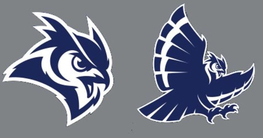
Rice Athletics releases new logos as part of rebranding initiative

From its founding in 1912, Rice Institute, later changed to Rice University, has featured the owl. As the years have passed, Rice’s owl has taken many forms, from an Athenian owl to a pygmy owl to a horned owl. That evolution and constant changing related to athletics has taken its next step. As part of a nearly two-year-long study, the Rice Athletic Department has launched a rebranding initiative, complete with new owl logos and letter marks. The new logos, first revealed in a leaked design on Reddit, include a proprietary script logo and a blue and white owl, one version with its beak open and one version swooping down with its talons extended.
The athletic department revealed the new marks at noon on Tuesday in the new state-of-the-art Brian Patterson Performance Center located just south of Rice Stadium. Various student athletes modeled what the new logos would look like on 2017 uniforms, polos and other Adidas attire. A plethora of events are set to accompany the brand refresh led primarily by members of the Rice Athletics team and Rice Rally Club.
Duncan junior Sergio Santamaria, the newly elected president of Rice Rally Club, said he is excited for the rebrand.
“We met with [Rice branding director] Lizzie [Haldane] extensively from a strategic standpoint on how to go about giveaways, promotions, spreading the word, passing out [gear and merchandise] on the sidewalks and getting the student body, one of the most important demographics, involved,” Santamaria said.
In addition to passing out free gear, Rally Club and Rice Athletics worked together to ensure each residential college streamed the press conference during the Tuesday lunch hour in their commons areas. Other plans for the week include a Willy’s Pub Trivia night featuring Rice Athletics trivia, a Thursday street activism team giving away branded items and free gear at the men and women’s tennis matches on Friday and Saturday, respectively. The large-scale push continues into the weekend with the first 200 students in attendance at the Rice baseball game on Saturday receiving free shirts and a large-scale block party in Rice Village on Saturday afternoon concludes the weeklong festivities.
The preliminary talks of rebranding date back to May 2015. Rice Athletics, including Athletic Director Joe Karlgaard, began brainstorming and implementing a plan that would produce a new logo for the Owls and their brand.
Karlgaard said rebranding was a primary goal of his heading into his job as athletic director.
“When I got here, one of the things I wanted to make sure we were doing well was positioning ourselves so we could be recognizable outside of the city of Houston [and] even within the city of Houston effectively,” Karlgaard said.
In October 2015, the university reached out to over 25,000 individuals seeking responses about Rice and its “brand perspective.” The idea behind these queries was to get a better idea regarding what the community thought of upon hearing the words “Rice University,” “Rice University Athletics” or any of its 16 Division I sports teams.
The results showed that the Old English “R” that is featured on the Rice baseball caps and on banners and advertisements throughout the city is the most recognizable and valued to the Rice community. However, there was not much of an association between any of the other current owl designs, such as the close-up of Owl eyes, and Rice. With this is mind, Rice decided to keep the popular “R” but proceed with the brand refresh in four new categories: the script logo, the owl head, the owl body and numerals for uniforms.
The rebranding needed to satisfy a few constraints. Visibility was a huge area of concern for everything that could be attached to the new logo and word marks. The view on television, billboards and websites had to be strong and attractive. The visibility on a court, jerseys, clothing and all merchandise had to be consistent and striking in its own right. The new marks, created by Torch Creative and Adidas, will be used exclusively as the previous owl marks and logos begin to filter themselves out from circulation.
Lizzie Haldane, the director of branding at Rice, spearheaded this project. Throughout the past two years, Haldane said she has worked extensively in incorporating feedback into the new designs.
“It was so important to be collaborative and cohesive in the entire process so we spoke to student athletes, coaches, administration, alumni and fans to ensure that we were able to reflect the perceptions of Rice athletics properly,” Haldane said.
Haldane also collaborated with the Student Athlete Advisory Committee. Committee President Ellen Diemert, a senior track and field/cross country runner, said Haldane reached out to the SAAC last semester for feedback on several different potential designs.
“We were very excited and in complete agreement with what [Haldane] presented,” Diemert said. “We loved that our logo could now be consistent just like the Old English “R” that you see everywhere in sports at Rice.”
Karlgaard said he is proud of the finished product and believes the marks are a symbol of the whole Rice community.
“I’m really proud of what we have accomplished as a collective team [because] we couldn’t just work with a designer and impart a new logo or marks on the community without getting the community and their feedback involved,” Karlgaard said.
More from The Rice Thresher
Sports Notebook: April 16-25
Rice men’s and women’s basketball programs each secured several transfer portal commitments last week.

04-23-2025 "Owl-American"
“Prepare for trouble and make it double!”

Men’s tennis wins AAC Championship with major upset
Rice men’s tennis traveled to Memphis, Tennessee, and pulled off a series of upset victories en route to winning the American Athletic Conference Championship.


Please note All comments are eligible for publication by The Rice Thresher.